
09 February 2015
It’s not about the looks
Over the years, we’ve come across a great many examples of marketing work where functionality has been sacrificed for design, and especially recently we seem to come across this more and more.
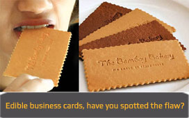
Now, of course, when you get something designed, you want it to look good to have your brand and company stand out and portray the right image. But it is important to realise that your company image does not hinge just on design. We’ve recently come across some examples where a business card had such an intricate and innovative design that it was actually quite hard to figure out the name of the person or indeed their company and details. Given that the function of a business card is to provide this, it wasn’t clever or original, but merely annoying. Surely not the image creation the company had in mind when commissioning their cards.
The business card example is slightly unusual, as it is usually websites who can fall foul of this. We have seen a great number of sites that, at first sight, look fantastic, are innovative and exciting and so tick all the boxes to make the site’s owners look good. However, when you then start to use the site, you actually find that the innovative menus are confusing, some of the amazing looking graphics get in the way of what you are trying to read and you can’t actually find what you are looking for. So the great first impression has been tarnished, and in some cases completely negated, due to the poor functionality and content. It promised much, but delivered little and this is not the lasting impression you want to create.
In another case, we have seen a company change its name to something rather unusual in their sector. A nice design was created and the name certainly stands out, but the company decided against using a secondary strapline to help explain what it does, deeming the name on its own powerful enough to accomplish this. When questioned, a 20 minute explanation followed outlining why the name was as relevant and powerful as it was deemed to be. And you know what? After the explanation, fair enough it all made sense. But if it needs a 20 minute explanation, is it really that powerful?
We are all for great design and good looking creative, but it is vital not to lose track of purpose and functionality. Ensure you don’t throw the baby out with the bathwater, by always keeping in mind who you are targeting, and how they are likely to react to what you are about to present them.
A good way to do this is to picture your most difficult/demanding client and anticipate how they would respond, or even do a little independent (and free) research by showing your bank manager, accountant or other professional, and ask for their opinion.
BACK TO LISTING

Recent Newsletters
Get satisfaction!
24 July 2017
Adding value to a legal practice
21 July 2017
Industry 4.0: the game is changing
20 July 2017
Sell The Sizzle Not The Sausage!
20 July 2017
Is Print Media Dead?
29 June 2017